RIKA
Building a distinctive, performance-led brand in a commoditised trade market.
RoleBrand ID & Direction | Product Graphic Design Direction

Challenge
RIKA entered a highly saturated category dominated by function-first competitors, where differentiation is often driven by price rather than brand. The challenge was to create an identity that could immediately signal quality, reliability and performance, while standing apart visually in a space with little brand equity or consistency.
The brand needed to establish credibility from launch, appealing to trade professionals who value trust and durability, while also creating a recognisable foundation that could scale across product, packaging and digital.
Approach
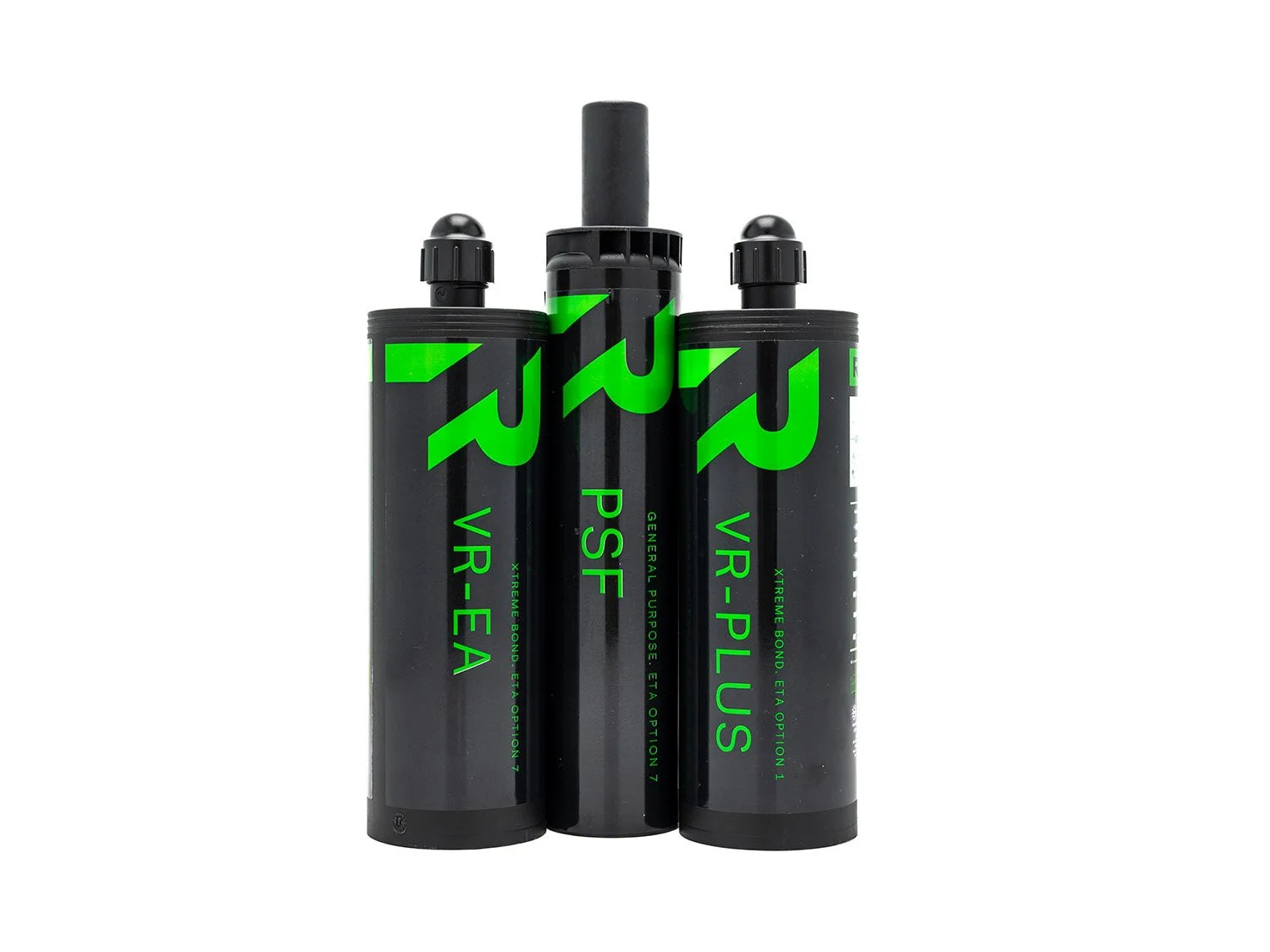
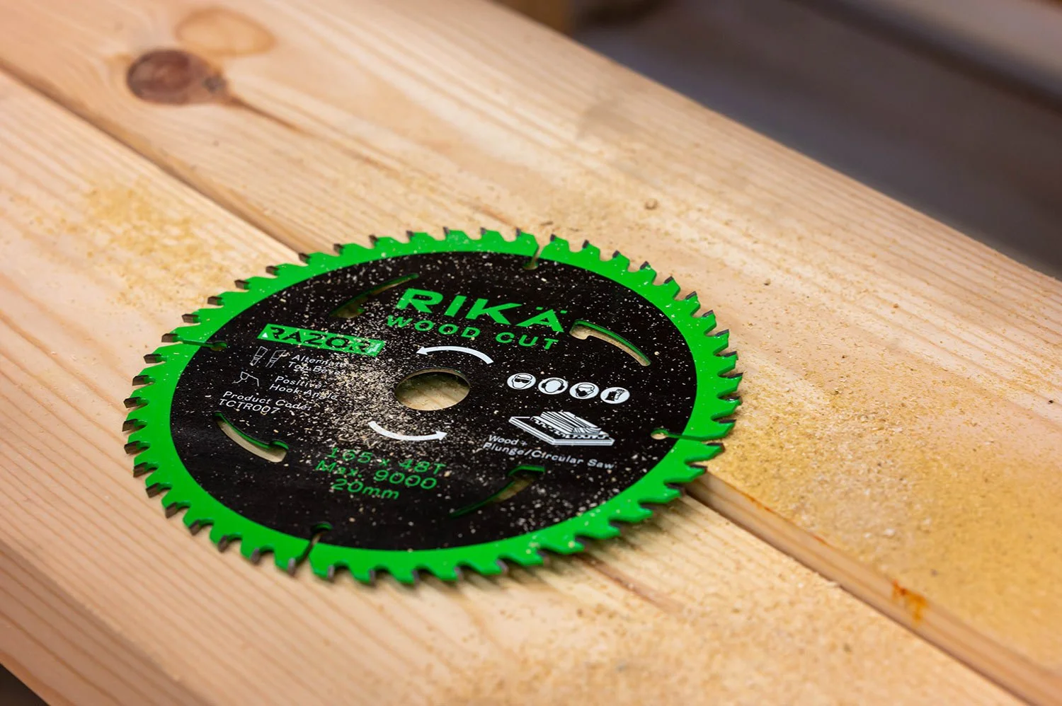
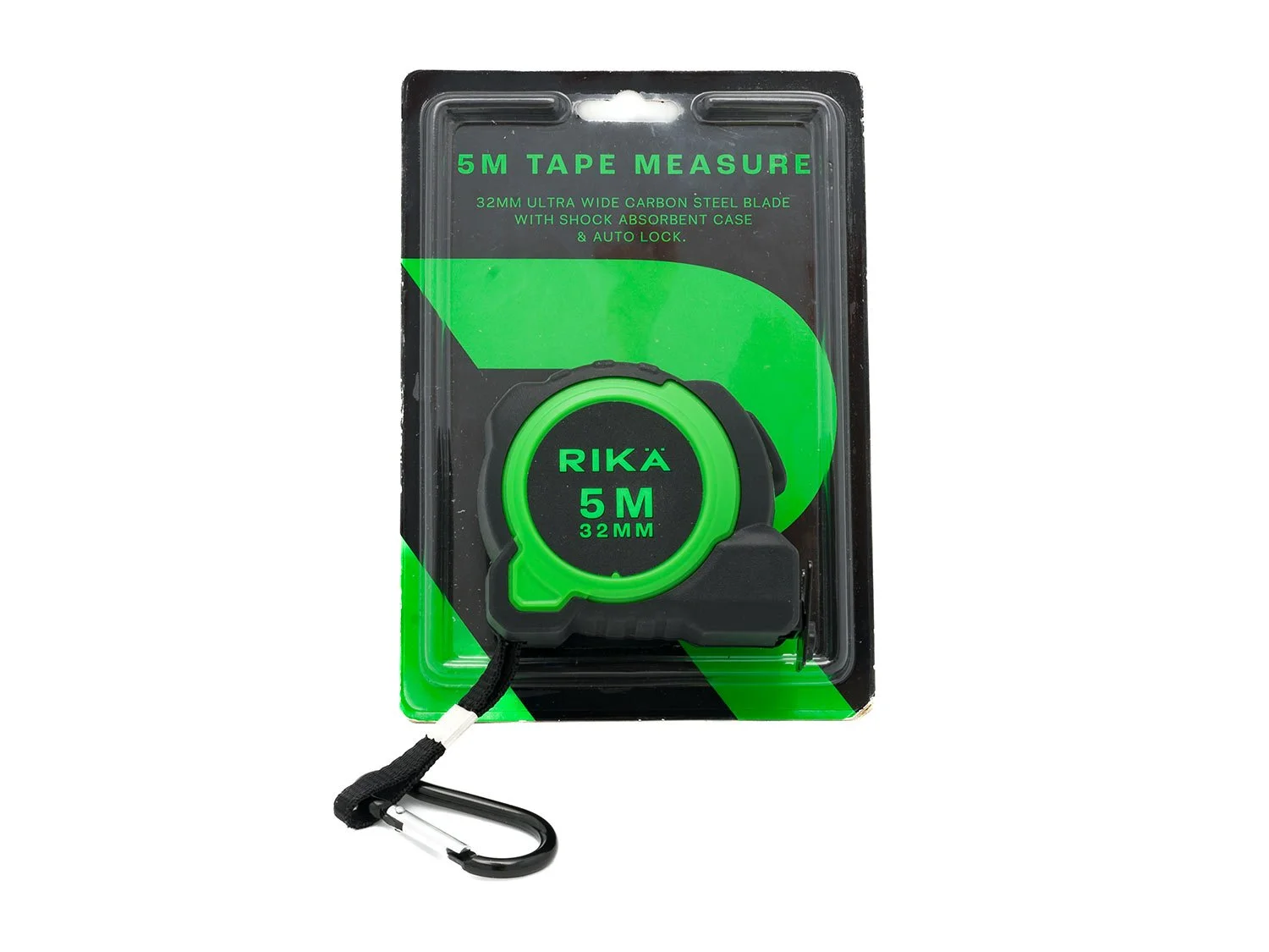
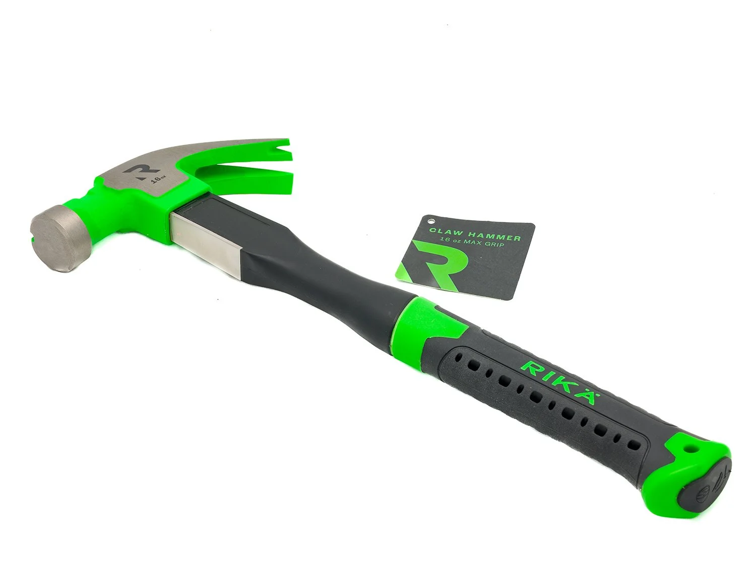
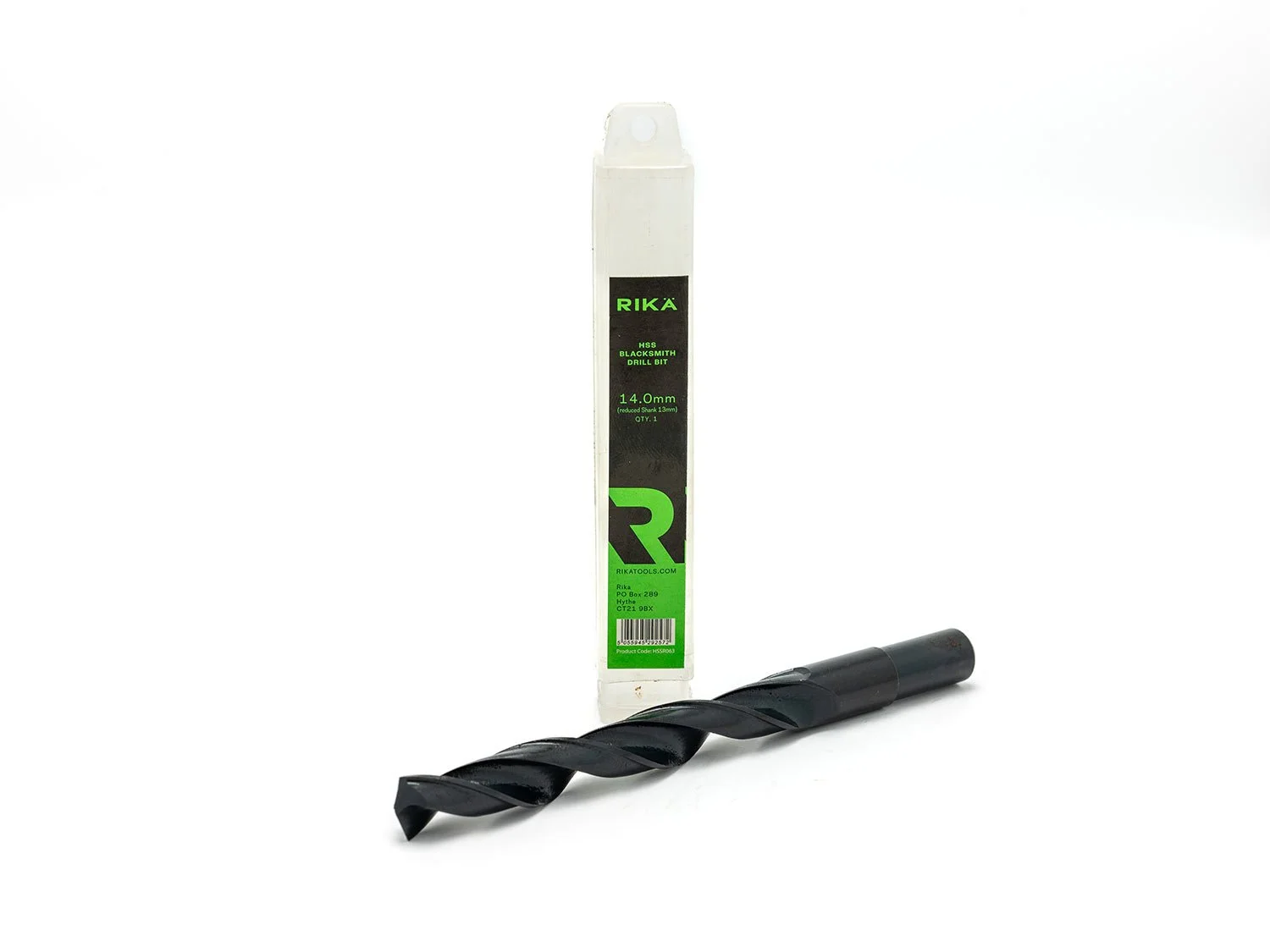
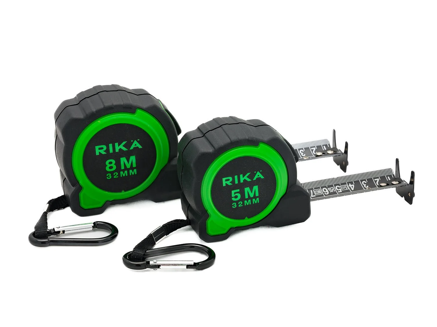
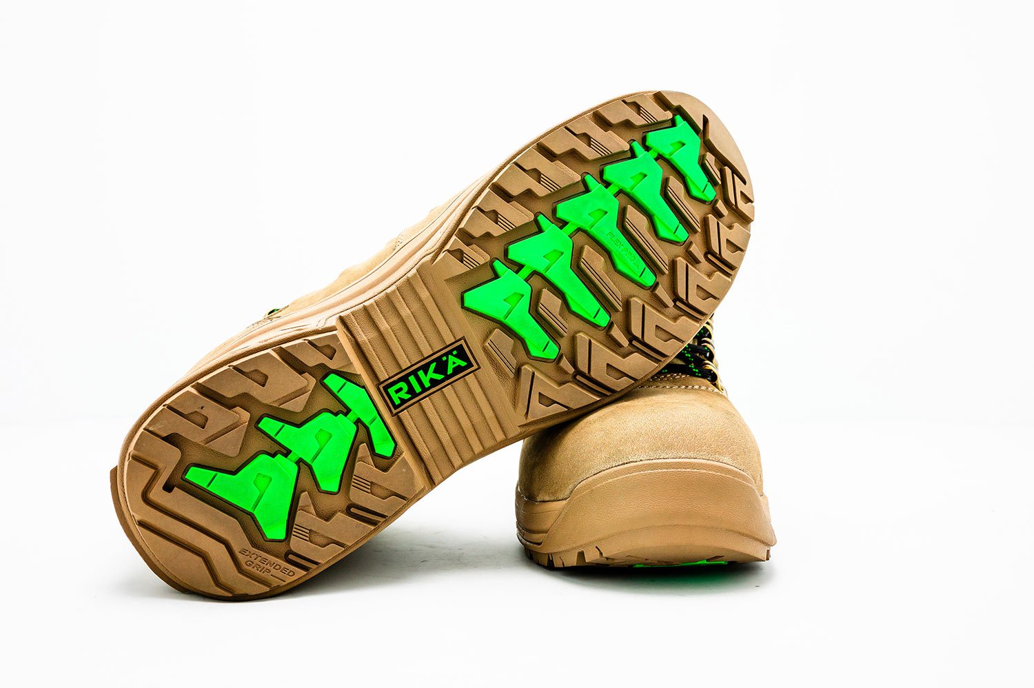
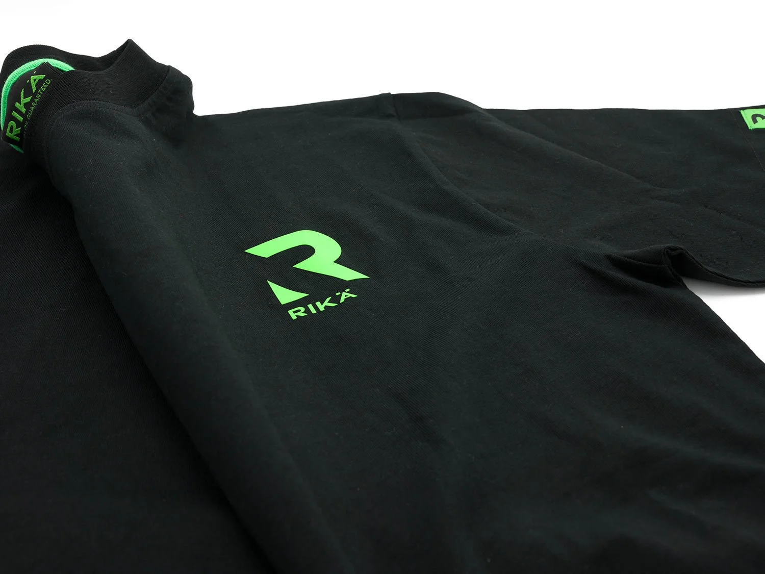
I led the development of RIKA’s brand strategy and identity from the ground up, creating a bold, minimal and utilitarian visual language designed to reflect the realities of the trade environment.
Built around three core principles, continuity, quality and reliability, the identity system was designed to be clear, consistent and highly functional across all touchpoints. From product design and packaging to digital direction, every element was considered to reinforce performance and trust.
The visual approach stripped away unnecessary complexity, using strong typography, disciplined colour and a modular system to ensure clarity, legibility and impact in both physical and digital contexts. The result was a brand designed to work as hard as the products themselves.
Outcome
The result was a distinctive and ownable brand foundation that positioned RIKA as a more premium and credible alternative within a crowded market.
By establishing a clear visual and strategic direction from the outset, the brand was equipped to launch with immediate impact and consistency across product and packaging. The work created a scalable identity system designed to support long-term growth, brand recognition and commercial value.